
Bold color can turn a wedding from nice to unforgettable. This post grew from a simple question I hear a lot: how do you pick colors that feel bold but true to you? I wanted to help couples move past safe palettes and own a look that sparks joy in photos and in real life. So I pulled together 15 bold wedding colors that cover everything from flowers to table settings, with ideas you can actually use on your big day.
Who it’s for? If you love color, if you want a wedding that feels bright and personal, this one is for you. If you’re planning a wedding or helping a couple choose a look, you’ll find palettes that fit modern venues and timeless moments.
What you’ll get? You’ll get 15 color ideas, plus practical tips for pairing, mixing finishes, and using color in decor, dresses, invitations, and lighting. I break down how to balance a bold shade like emerald or fuchsia with soft neutrals so the space still feels warm. You’ll see real world examples: a jewel-toned bouquet against a pale dress, a cake with a pop of citrus, or napkins that tie a room together.
Here is how to use them. Start with one anchor color. Pick two supporting shades. Try swatches in daylight and in your venue’s lights. Look at photos of the room and see how the color changes as the sun moves. If a shade feels loud, soften it with a lighter partner.
You might be surprised by color #7. It is a bold blend that sounds wild at first, but when you pair it with cream, gold, or sage, it shines in the right room. It can make your photos pop and keep the overall look warm and inviting.
Ready to try these ideas? Start by saving the palettes you love. Build simple photo mockups, check how the colors look on your invitations, and ask your florist to show sample combos. When you tour venues, bring swatches to see how lighting changes the mood. This guide is your starter kit for a bold, unforgettable wedding color story.
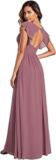
1. Radiant Orchid:

If you want a color that feels romantic and warm, Radiant Orchid could be your punch of personality. It lights up spaces without stealing the show. For a clean, chic look, pair it with teal or gold.
Why Radiant Orchid works
Here is why Radiant Orchid works on a wedding day:
– It flatters many skin tones when lit with soft, warm lights.
– It blends well with both garden greens and metallics, so your decor stays cohesive.
– It shows up beautifully in photos, from closeups to wide shots.
Practical uses
Next, practical ways to use this shade:
– Bridesmaid dresses: choose flowing gowns in Radiant Orchid for a romantic line.
– Floral work: mix orchid blooms with dahlias and roses for lush arrangements.
– Decor touches: drape table runners, napkins, or chair sashes in orchid.
– Cake accents: a few sugar orchids or a fondant ribbon highlight.
Pairing ideas
Pairing ideas to keep the look balanced:
– Primary pairings: teal and gold.
– Soft companions: blush, sage, cream for a calm, airy vibe.
– Texture tricks: mix satin, lace, and velvet for depth.
Season and setting tips
Seasonal and setting notes to guide your choice:
– In outdoor spring or summer weddings, orchid pops against greenery.
– In ballroom receptions, add warm lighting to make the color glow.
Photography notes
How to photograph Radiant Orchid well:
– This shade helps skin glow and creates warm, inviting images.
– Keep lighting even to avoid washed-out tones.
Next steps
Guidance to move from idea to reality:
– Order swatch cards and test under your lighting.
– Decide where you want the color to appear most, then plan accents around it.
1. Radiant Orchid:
Editor’s Choice
Women’s Flowy Chiffon A Line Ruffles Sleeves Back Cutout Bridesmaid Dres…

6PCS 32″ Artificial Orchid Stems White Butterfly Orchid Faux Phalaenopsi…
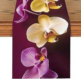
ANNA QUEEN Orchid Table Runner 13×72 Inch, Elegant Purple Yellow White O…
2. Bold Red:

If you want a color that sparks warmth and romance, red fits. It speaks love without shouting. When you use red with white, the room feels both lively and chic.
Here’s how to use it.
– Bouquets: deep red roses, velvet tulips, and peonies give texture and scent.
– Decor: red linens, pillar candles, and slim gold accents create a glow.
– Accents: red shoes, a red lip, or a red napkin at each setting.
Pairing ideas that work:
– White or ivory for crisp contrast.
– Blush or champagne to soften the look.
– Gold or brass details for a touch of elegance.
Shade choices to consider:
– Ruby for bold drama.
– Scarlet for bright energy.
– Burgundy for evening warmth.
Tips you can use now:
– Test swatches in the venue light before you buy.
– Mix matte fabrics with a touch of shine to keep things balanced.
– Use red in small doses if your venue is busy or patterned.
Common questions:
– Will red feel heavy? Use white space and light fabrics to keep balance.
– Can red work in any season? Yes, with different textures like satin in winter or linen in summer.
Next steps: build sample boards, order dye swatches, and plan red accents around key photos.
2. Bold Red:
Editor’s Choice

12PCS Artificial Roses Silk Flowers Fake Roses Bouquet Long Stem for Hom…
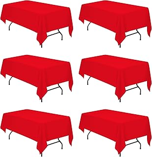
BRILLMAX 6 Pack Red Tablecloths for 6 Foot Rectangle Tables 60 x 102 Inc…

3 Pack 3×6 Inch Red Pillar Candles for Romantic Valentine’s Day and Chri…

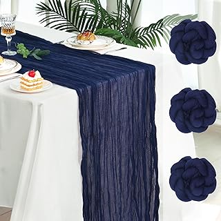
Deep Navy
Deep navy adds depth and a quiet sense of luxury to your wedding day. The color looks elegant in any light. It pairs well with lighter shades like blush or gold for a chic, readable contrast. Use it as a backbone across outfits and decor to create a cohesive, timeless feel.
– Attire: Groomsmen in navy suits with blush ties create a crisp, stylish look. A navy suit reads formal without feeling stuffy. The blush tie adds a soft pop near the face.
– Decor: Navy table runners anchor the room and create clean lines. Use ivory centerpieces to soften the space and keep it bright.
– Invitations: Deep navy ink on cream stock looks regal and is easy to read. This shade travels well with gold foil or simple white envelopes.
– Accents: Gold and ivory highlight navy without stealing the show. Use these accents in small touches like place cards or napkin rings.
– Mood: Navy shines in candlelight or cool winter light, giving your space a refined glow. It pairs well with greenery for a fresh touch.
Balance is key. Choose one navy item to lead the look. Add two lighter tones to keep things airy.
Next steps:
1. Pick a navy shade that fits your venue and skin tones.
2. Choose two accent colors to pair with navy, such as blush and gold.
3. Create a simple mood board and collect fabric swatches.
4. Share the plan with vendors and test lighting.
With navy, your day feels elegant and inviting.
Editor’s Choice
TIE G Solid Satin Woven dyed Color Formal Black Necktie and Pocket Squar…

4. Bright Yellow:

Bright yellow adds sunshine to your wedding. It signals joy and warmth. This hue works best in spring and summer celebrations. You can use it in flowers, decor, and even outfits to lift the mood.
Here is how to use bright yellow without overwhelming the day.
– Bouquet ideas: Mix sunflowers with yellow roses and daisies. Add sprigs of greenery like eucalyptus for depth. A bouquet with a touch of white or pale pink keeps it fresh. Try mixed heights for texture.
– Decor ideas: Put yellow table settings or napkins where guests sit. Add small yellow candles for glow. Use yellow glassware or votives to catch light. Tie in wood tones to soften the bright hue.
– Accent color pairings: Pair with navy or gray for a crisp, modern look. Try soft pastels for a gentle take. For a carefree vibe, sprinkle in a rainbow of bright accents in small doses.
Next steps for getting it right: pick one or two yellow shades and test them side by side in fabric swatches or flower photos. Use natural wood and a few neutrals to balance brightness. Let yellow shine in focal spots and keep the rest calm.
With mindful use, bright yellow brings warm smiles and a sunny feel that guests remember.
Bright yellow is the sunshine your wedding needs! Use this bold wedding color in your flowers and decor to spark joy and warmth, making your big day unforgettable.
4. Bright Yellow:
Editor’s Choice

Benchmark Bouquets – Flowering Fields (Glass Vase Included) – Fresh Flow…

PurpleEssences Set of 12 Hemstitch Cloth Dinner Napkins 100% Cotton – So…

Aroma Naturals Ambiance Votive Candle, Yellow/Orange/Lemongrass, 6 Count
5. Emerald Green:

You want a color that feels lush and timeless. Emerald green fits. It nods to nature and renewal, and it adds a calm glow to your day.
– Attire: Bridesmaids in emerald dresses look radiant.
– Decor: Use emerald in centerpieces, table runners, and drapery. Add real greenery for texture.
– Accent colors: Gold adds sparkle. Soft pink or ivory keeps the look balanced.
Emerald green brings forest calm to your space. It pairs with warm metals and light neutrals, helping your wedding feel grounded.
Here is how to pull it off.
– Step 1: Pick your shade. Deep emerald reads luxe; a brighter tone feels earthy. Test swatches with flowers.
– Step 2: Choose fabrics. Satin or velvet add depth for dresses. Linen keeps tables relaxed.
– Step 3: Balance the palette. Emerald is the main note; add gold or blush as accents.
– Step 4: Light it right. Warm white or amber lighting lifts emerald.
Common questions.
– Will emerald clash with other colors? It blends well with gold, blush, ivory, and wood tones.
– Can emerald work outdoors? Yes, it shines with natural greenery.
Next steps.
– Gather color swatches and fabric samples. Plan a small bouquet and a test tablescape.
5. Emerald Green:
Editor’s Choice

12 Pack Emerald Green Satin Table Runner 12 x 108 Inch Long Premium Tabl…

Womens Long Semi Formal Cocktail Dresses Square Neck Split Elegant Eveni…

JMEXSUSS 200 LED String Lights Indoor Outdoor Clear Wire, Connectable Wa…
6. Coral:

6. Coral
Coral blends pink and orange in a soft glow. It feels warm but never loud. This coral wedding color shines in sunlit spaces, perfect for beach weddings or summer celebrations. You’ll see coral create a friendly, inviting mood.
Here is why coral works on your big day. It pairs well with blues, whites, and sandy neutrals. It invites light and adds a friendly touch to any decor.
– Bouquets: think coral peonies, roses, or tulips.
– Decor: coral table runners, chair sashes, or napkin rings.
– Accents: pair coral with soft blue, white, or sand tones.
Next steps: plan coral in small, balanced doses. Use base neutrals as a backdrop so coral pops just enough. Let the light do the rest; warm-white bulbs or the sun keeps coral vivid.
Practical ideas you can use now:
– Start with a white or sandy base for linens.
– Add coral in one or two places, like a bouquet and a centerpiece.
– Bring in texture with rattan, wicker, or seashell accents.
Be honest about limits: too much coral can feel busy. Scale with calm blues or whites to keep the look fresh and relaxed. This palette fits sunny vows and easy summer photos.
You can carry coral into invitations, cake accents, and wedding favors to keep the theme cohesive.
6. Coral:
Editor’s Choice

Coral Pink Peonies Artificial Flowers,4 Pcs Fake Silk Peonies with Stems…
Socomi Coral Peach Fall Thanksgiving Cheesecloth Table Runner Boho Rusti…
WELMATCH Coral Spandex Chair Bands Sashes – 50 pcs Wedding Banquet Party…
7. Tropical Teal:

If you want a bold yet classy look, tropical teal could be your perfect color. It blends blue with green for a sea-air vibe that feels fresh yet timeless. Teal can bring calm to the room while still making a statement in photos.
Here is why it works on a wedding day. Teal reads as sophisticated but not stiff. It’s easy to pair with bright yellows or clean whites for a sunny, resort-like feel. In photos, teal acts like a quiet backdrop that makes other colors pop.
– Attire: Try teal bridesmaid dresses or teal ties for the groomsmen. This keeps the wedding party cohesive without overpowering.
– Floral arrangements: Add teal accents through ribbon wraps, blue-green flowers, or small accent blooms tucked into bouquets.
– Accent colors: Pair teal with sunny yellows, soft corals, or crisp whites to balance the look.
Here is how to pull it off smoothly. Build a simple palette with 2–3 teal shades and 1–2 supporting colors. Choose fabrics that hold color well, like satin or chiffon, to keep the teal looking clean. Use teal in a few key decor pieces—table runners, glassware, and napkins—to avoid overwhelm. Lighting matters; natural daylight makes teal sing, while warm white tones keep it cozy after dark.
Choosing tropical teal sets a playful, inviting mood that draws guests into your world of love and adventure.
Tropical teal is your go-to for a bold yet classy wedding vibe! It effortlessly blends sophistication with a refreshing sea-air feel, making it the perfect backdrop for vibrant pops of color.
7. Tropical Teal:
Editor’s Choice

Infinity Dress with Bandeau, Convertible Bridesmaid Dress, Long, Plus Si…

12 Pack Teal Blue Table Runner 12×108 Inches Long, Satin Silk-Like Smoot…

Letjolt Artificial Calla Lily Teal Flowers for Wedding Bouquet Flower 12…
You might also like


8. Blushing Pink:

8. Blushing Pink
Looking for a color that feels romantic but not loud? Blushing pink brings warmth and softness to a wedding. It looks fresh in daylight or candlelight. Pair it with white and gold for a clean, elegant vibe you can trust.
This shade works anywhere. It flatters most skin tones and blends with greenery. Mix tones or layers to make the pink calm or more noticeable. Try pairing with olive or eucalyptus greens and a touch of ivory for a natural, timeless look. A soft gradient of pinks adds depth, from blush to rose.
– Bouquets: light pink roses, peonies, hydrangeas.
– Decor and attire: blush runners, draped fabric, pale pink bridesmaids.
– Accents: white china, gold flatware, warm candlelight.
Frame pink with white for clarity and add gold touches for shine. Use textures like satin, velvet, or lace. A few green leaves keep it fresh. Add ribbons or napkins in a lighter pink to create depth without overwhelming.
Too much pink can feel sugary. Keep lines simple, leave white space, and let pink shine in a few well-chosen spots.
Start with swatches, build a mood board, and test lighting at your venue. Ask florists for three pink options in different textures to see what blends. This approach keeps your day cohesive and easy to plan.
Blushing pink isn’t just a color; it’s a feeling! Combine it with white and gold for a timeless elegance that flatters all skin tones—perfect for a romantic wedding vibe!
8. Blushing Pink:
Editor’s Choice

6 Pack Blush Pink Cheesecloth Table Runner 10FT Boho Gauze Fabric Table …

Wedding Bouquets for Bride – Artificial Bridal Bouquets Pre-Made Roses F…

40 Piece Gold Silverware Set for 8, Terlulu Stainless Steel Flatware Set…
9. Fiery Orange:

You want a color that stands out but stays warm. Fiery orange hits that mark. It shines in autumn weddings and makes the day feel cozy and inviting.
Here is why it fits this season. It brings energy to photos and helps guests feel welcome. It looks great next to soft lighting and natural textures like wood and candle glow.
Next steps for using it on your day:
– Bouquets: orange dahlias, marigolds, or tulips create a bright focus. Pair them with ivory blooms or dark greens to keep the look balanced.
– Decor: use fiery orange in table runners or napkins. Add warm candles and wooden accents to create a friendly, comfortable vibe.
– Accent colors: pair with burgundy, brown, or gold to build a rich fall palette. Let orange be the star while the others support it.
Tips to pull it off well: test the color in natural light at your venue. Too much orange can feel loud, so place it where you want the main impact. Use soft neutrals in clothing and stationery to let the orange pop.
Want a quick plan? Make a mood board with orange flowers, fabric swatches, and lighting ideas. See how it reads at your venue before you buy.
9. Fiery Orange:
Editor’s Choice

3Pcs Orange Artificial Dahlia Flowers Fall Fake Flower Silk Flowers with…

4 Pack Orange Cheesecloth Table Runner 20 x 120 inch Gauze Table Runners…

ROZATO Candle Warmer Lamp + Set of 4 Small Scented Jar Candles, With USB…
10. Lavender:

If you want a color that feels bold and calm, lavender is for you. It adds calm, romance, a hint of magic to photos. It works well in spring and summer weddings.
Here is how to use lavender in practice:
– Bouquets: Lavender roses, hydrangeas, or lilacs create a dreamy mix.
– Decor: Lavender napkins, runners, or soft uplighting glow.
– Accents: Pair lavender with soft yellows, sage greens, or whites.
Next, practical tips to keep it simple:
– Pick two lavender tones. Light lilac on walls, deeper shade in florals adds depth.
– Mix matte and satin fabrics in the same family for texture.
– Check color swatches under your venue lighting before buying.
Tips for a cohesive look:
– Use lavender in at least two places, like the bouquet and bridesmaids’ dresses, or the cake and table settings.
– Add natural textures such as linen, wood, and greenery to keep the color lively.
Common questions:
– Outdoor use: Lavender pops with greens and whites and won’t clash with the sky.
– Trend factor: It stays fresh when paired with neutrals.
Next steps:
– Gather lavender swatches.
– Pick a focal lavender item, bouquet or dress.
– Plan a palette of lavender, white, and sage.
Lavender gives your day glow.
10. Lavender:
Editor’s Choice

Benchmark Bouquets – Oriental Lilies & Lavender Roses (Glass Vase Includ…
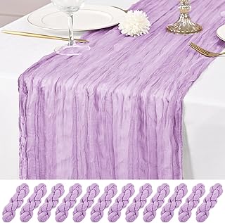
12 Pack Lavender Table Runner 10Ft Cheesecloth Table Runner Rustic Gauze…

Efavormart 6W Purple LED Backdrop Uplight, Outdoor Waterproof Landscape …
11. Charcoal Gray:

You want a color that feels fresh. Charcoal gray works. It acts as a canvas, letting bold shades pop. Matte fabrics keep it calm, while touches of satin or velvet add depth. You get a modern look that still reads timeless in photos.
Here is where to use charcoal gray on your big day.
– Attire: Charcoal gray suits for the groom and groomsmen look sharp. Pair them with bold ties.
– Decor: Use charcoal gray for table runners, napkins, or centerpieces to anchor the room.
– Accents: Accents in florals or cards so gray stays the backdrop.
Pair it with bright accents to wake up the mood. Fuchsia, teal, or emerald work well, but keep the palette balanced with ivory, champagne, or soft blush as your light counterpoint.
Tips to pull it off well. Choose textures to keep things lively—velvet, linen, or satin help. Mix matte gray with a bit of gloss for contrast. Plan lighting that flatters the shade; warm lights soften the look, cool lights sharpen it.
Here’s how to start. Build a palette: charcoal gray, two bright accents, and a light neutral. Get swatches, test them in your venue, and save ideas.
Guests will notice the calm.
11. Charcoal Gray:
Editor’s Choice

Men’s 3 Piece Suit Set with Tie, 2 Button Slim Fit Solid Blazer Jacket V…

DII Velvet Collection Tabletop, Table Runner, 14×72, Cream
ANECO 12 Pieces Satin Napkins Soft Dinner Napkins Square Table Napkins 1…
12. Sunset Pink:

If you want a warm, dreamy wedding, sunset pink is your go-to. This soft pink glows with the light of a sunset and stays gentle. It adds warmth without shouting, so photos stay timeless. Use it in flowers, fabrics, and table settings. It works indoors or outdoors. Next steps will help you apply it well.
What sunset pink does for your day
Sunset pink creates a welcoming mood. It blends with orange and peach tones for warmth and with pale blues for a calm touch. The color stays soft yet memorable, ideal for a romantic vibe that shines in photos and in person.
Ways to bring sunset pink to life
– Bouquets: Sunset pink roses, peonies, and daisies make a gentle focal point.
– Decor: Soft pink table settings, blush linens, and warm candlelight set a romantic scene.
– Attire: Bridesmaid dresses in satin or chiffon in sunset pink look chic.
– Accents: Pair with soft oranges, yellows, or light blues to balance the palette.
Here’s how to plan it. Start with one strong element, then echo it in other details. Let the bouquet lead, and mirror that hue in napkins and ribbons. Use warm lighting to boost the glow, especially at golden hour.
Be honest about limits. Sunset pink can wash out in bright sun, so time your photos or add deeper accents for contrast. With careful planning, this color brings warmth and a welcoming vibe for every guest.
12. Sunset Pink:
Editor’s Choice
3 Pack Pink and Orange Plastic Tablecloth Party Decorations, Groovy Hot …

ATFL Fake Sunset Red Roses Artificial Flowers Bulk,Floral Diameter 4”,1…
Pink Beach Candle 9.17oz | Sunrise/Sunset at The Bahamas’ Hubble Island …
13. Gold and Jewel Tones:

Gold and Jewel Tones
Gold with jewel tones creates a warm, formal mood. It reads luxury without shouting. You get depth and shine in one look. This pairing works in both classic and modern weddings. Here is why this pairing works and how to use it.
– Decor: Lay a gold table runner or gold chargers. Add candle holders in brass or gold. Use jewel-tone linens in emerald, sapphire, or ruby for contrast. Keep walls and florals simple so the gold glows.
– Attire: Let bridesmaids wear jewel tones that pop next to gold. Add gold touches to men’s ties, pocket squares, or cufflinks to finish the look.
– Bouquets and florals: Mix deep jewel tones in the blooms. Add small gold accents on blooms to catch the light.
– Invitations and details: Use gold foil or edged invitations for luxe. Mirror or glass pieces with gold trim pair well with menus and place cards.
– Lighting and ambiance: Soft amber light makes jewel tones glow with gold.
– Practical tips: Start with one gold base and two jewel tones. Test swatches in daylight and at the venue. Avoid many competing hues to keep it cohesive.
13. Gold and Jewel Tones:
Editor’s Choice

Artoid Mode Beige Gold Gauze Table Runner 120 Inch 10FT, Glitter Metalli…

Laura Ashley Dothan Luxury Linen Blend Tablecloth for Formal Dining, Hol…

Puremigo 50 Pack Pre-Folded Vellum Jackets for 5×7 Invitations – Gold Fo…
14. Bold Fuchsia:

Want a color that adds playfulness to your big day without stealing the show? Bold fuchsia fits the bill. This pinkish purple shade pops in photos and stays lively in person. You gain warmth and a fresh, modern mood. Here is why it works well for many setups: it plays nicely with different lights, it looks clean beside neutrals, and it keeps your love story feeling bright.
Where to use bold fuchsia
– Bouquets: choose fuchsia blooms like dahlias or gerberas to create a bold focal point.
– Decor: bright fuchsia runners, napkins, or votive candles energize the room.
– Attire: add a fuchsia sash, a pop of color on bridesmaids’ dresses, or a tie for the groom party.
Pairing ideas
– Contrast with black for a chic, modern vibe.
– Pair with orange for a sunny, playful twist.
– Mix lighter pinks or purples for depth without a crowded look.
How to pull it off
– Start with the bouquet to set the tone.
– Add scattered fuchsia accents to tables and cake displays.
– Balance bold color with neutral whites, creams, or soft gray.
– Check how it looks in daylight and evening light.
Practical tips
– Use a few shades of fuchsia so it doesn’t feel flat.
– Mix textures like matte ribbons with glossy candles.
– Test color in photos to see how it reads on screen.
Next steps
If you love a lively vibe, try fuchsia as the kickoff color for your palette. It pairs with many styles and stays memorable in photos.
Bold fuchsia is your secret weapon for a playful yet elegant wedding! This vibrant hue not only pops in photos but also brings warmth and a modern touch to every setup. Don’t be afraid to embrace bold wedding colors for the day of your dreams!
14. Bold Fuchsia:
Editor’s Choice

Serwalin Artificial Flowers Dark Magenta Hot Pink Fake Wedding Flowers S…

Table Runner Cheesecloth 10FT Fuchsia Boho Gauze Cheese Cloth Rustic She…

Zest Candle CVZ-007 12-Piece Votive Candles, Hot Pink
15. Honey Yellow:

Honey yellow brings warmth to your day. It feels like the sun and a friendly smile in the room. For outdoor spring and summer weddings, this shade shines. Use honey yellow in flowers, outfits, and tables to create a welcoming vibe. Pair it with greens, coral, or white to keep the look fresh.
– Bouquets: Add honey yellow blooms like sunflowers, daisies, or lilies. Mix in a few white blooms for contrast. A touch of greenery ties the bouquet to the season.
– Decor: Choose honey yellow table linens, candles, or napkin rings. Yellow accents on chairs or menu cards lift the space.
– Accent colors: Greens bring a garden feel. Coral adds warmth. White keeps things clean and bright.
You gain a warm mood, bright photos, and cohesion. Practical tips: pick a dominant honey yellow and add three to five pops of green or coral. Use natural fabrics like linen or cotton for a relaxed outdoor look. In lighting, opt for warm bulbs or schedule ceremony near sunset to boost honey glow. If too much yellow worries you, sprinkle it in small doses with white walls or lots of greenery.
Next steps: gather sample flowers, test fabrics, and take mock photos at times of day.
15. Honey Yellow:
Editor’s Choice

Rectangle Tablecloths 90×132 Inch 2 Pack Yellow Tablecloth Washable Deco…
Crochet Flower Bouquet Handmade Yellow Sunflower Artificial Flowers with…

A19 LED Light Bulbs, 60 Watt Equivalent LED Bulbs, Soft White 2700K, 800…
Conclusion

Bringing together these 15 bold wedding colors allows you to craft a theme that truly represents you as a couple. From the fiery passion of red to the tranquil beauty of teal, each color tells a unique story.
As you embark on this exciting journey, let your personality shine through with bold, vibrant palettes that reflect your love. Explore these options, mix and match, and don’t hesitate to make a statement on your big day!
Note: We aim to provide accurate product links, but some may occasionally expire or become unavailable. If this happens, please search directly on Amazon for the product or a suitable alternative.
This post contains Amazon affiliate links, meaning I may earn a small commission if you purchase through my links, at no extra cost to you.
Frequently Asked Questions
What Are Some Tips for Choosing Bold Wedding Colors That Reflect Our Personal Style?
Choosing bold wedding colors can be an exciting yet challenging task! Start by exploring shades that resonate with you as a couple. Consider your favorite colors and how they might blend to create a unique palette.
Think about the emotions you want to evoke on your big day—do you want warmth, joy, or romance? Don’t hesitate to mix vibrant themes like bold red with deep navy for a striking contrast. Remember, the key is to stay true to yourselves while being adventurous with your choices!
How Can We Incorporate Bold Colors into Our Wedding Decor?
Incorporating bold colors into your wedding decor can truly elevate your celebration! Start with large elements like table linens, backdrops, or centerpieces to make a strong statement.
Use vibrant flowers in your bouquets and arrangements to add pops of color. Consider applying bold hues through lighting, which can create a magical atmosphere in the evening. Pairing colors like radiant orchid with gold accents can add sophistication and depth to your decor!
What Are Some Unique Color Combinations for a Bold Wedding Theme?
Unique color combinations can make your wedding theme unforgettable! Consider pairing tropical teal with coral for a fresh, beachy vibe. Another stunning option is fiery orange paired with charcoal gray, which balances warmth with modern elegance.
Don’t shy away from mixing jewel tones like emerald green with gold for a touch of luxury. Experimenting with different combinations can lead to a vibrant theme that’s uniquely yours!
How Do Seasonal Changes Affect the Choice of Bold Wedding Colors?
Seasonal changes can greatly influence your choice of bold wedding colors! For instance, bright yellows and fiery oranges are perfect for summer and autumn weddings, bringing warmth and joy to your celebration.
In contrast, deep navy and radiant orchid can create a stunning backdrop for winter ceremonies. Spring invites soft, romantic shades like blushing pink and lavender, while summer allows you to explore vibrant hues like coral and tropical teal that reflect the season’s energy!
Can Bold Wedding Colors Work for a More Traditional Wedding Theme?
Absolutely! Bold wedding colors can seamlessly integrate into a traditional theme with the right approach. For example, using deep jewel tones like emerald green or bold fuchsia alongside classic elements like white florals and gold accents can create an elegant and sophisticated look.
Think of incorporating bold colors in subtle ways, like in your bridal party attire or table settings, to maintain a traditional feel while adding a modern twist that makes your big day unforgettable!
Related Topics
bold wedding colors
unique color palettes
vibrant themes
seasonal weddings
romantic color schemes
wedding color trends
autumn weddings
spring weddings
luxury wedding decor
color combination ideas
wedding planning tips
rustic wedding colors
")

")